Delphi Research · Crowdsourcing
Art Beyond Sight
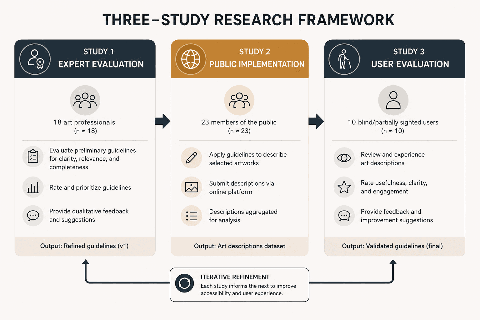
• Ran a 3-phase research study for The Hepworth Wakefield Museum to test whether non-experts in art could write artwork descriptions good enough to make museums accessible for blind and partially sighted visitors. • Used the Delphi method with 18 art professionals and 10 blind/partially sighted people to refine a set of guidelines, then had 23 members of the public apply them to real artworks, then had the original blind/partially sighted participants rate the results. Applied 2 Statistical tests like Friedman's ANOVA and Wilcoxon across 3 phases of the study. • Non-expert describers, working from tested guidelines, produced descriptions rated as genuinely useful (about size, colour, description length). • Delivered as a recommendation for a museum accessibility program.

Starting Point
Museums call it accessible. It rarely is.
This project was carried out for The Hepworth Wakefield, a modern and contemporary art museum in West Yorkshire. Like most museums, it has made real progress on physical access such as ramps, lifts, accessible routes. But most visual art still isn't described in any meaningful way for blind and partially sighted visitors. Where descriptions exist at all, they're usually minimal alt text, written by whoever had five minutes, with no shared standard for what "good" even means.
The instinct is to solve this with money and specialists: hire professional describers, write bespoke audio guides. But museums don't have that budget, and most artworks in most collections will never get that treatment. So the real question isn't "what does the perfect description look like." It's:
Can non-art experts write art descriptions good enough to actually serve blind and partially sighted visitors? And what would make that possible at scale?
Study 1
Why Delphi? I needed consensus, not a single opinion.
Before any of the studies, I needed something concrete for people to work with:
A working set of eight short guidelines, plain-language instructions covering things like how to describe size, how to handle colour, how much of your own interpretation to include that anyone, expert or not, could follow to write a description of a painting for a blind or partially sighted person.
Think of it as a style guide for describing what you're looking at, in words that don't assume the reader has ever seen it.
An earlier MSc project (Bai, 2022) had already built a first draft of these guidelines, but it had one major gap: it was tested only on sighted members of the public. Nobody who was actually blind or partially sighted had ever weighed in on whether the guidelines described the right things.
A single round of feedback via a survey, a focus group would have given me opinions. It wouldn't have given me convergence. Art professionals and blind/partially sighted people come at "what makes a good description" from genuinely different places: one group thinks about accuracy and technique, the other thinks about what's actually useful to hear. I needed a method that let both groups react to each other's reasoning, not just register their own.
That's why I used the Delphi method: participants rate and comment on each guideline, I anonymously summarise the reasoning behind the ratings, and the group reconsiders in light of it. The guidelines that have actually been stress-tested against disagreement, not just collected as a list of preferences.
I recruited 18 people working in the art world and 10 blind and partially sighted people, and ran the questionnaire through a first round of ratings and open comments.
Study 2
What I found: Can non-experts actually use this?
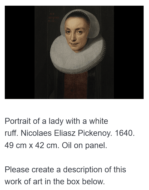
With the revised guidelines in hand, I needed to know something Study 1 couldn't tell me: could general public actually apply this in practice? I recruited 23 members of the public through Prolific and asked each to write descriptions for three of six artworks, then reflect on the experience. An example of an artwork image:
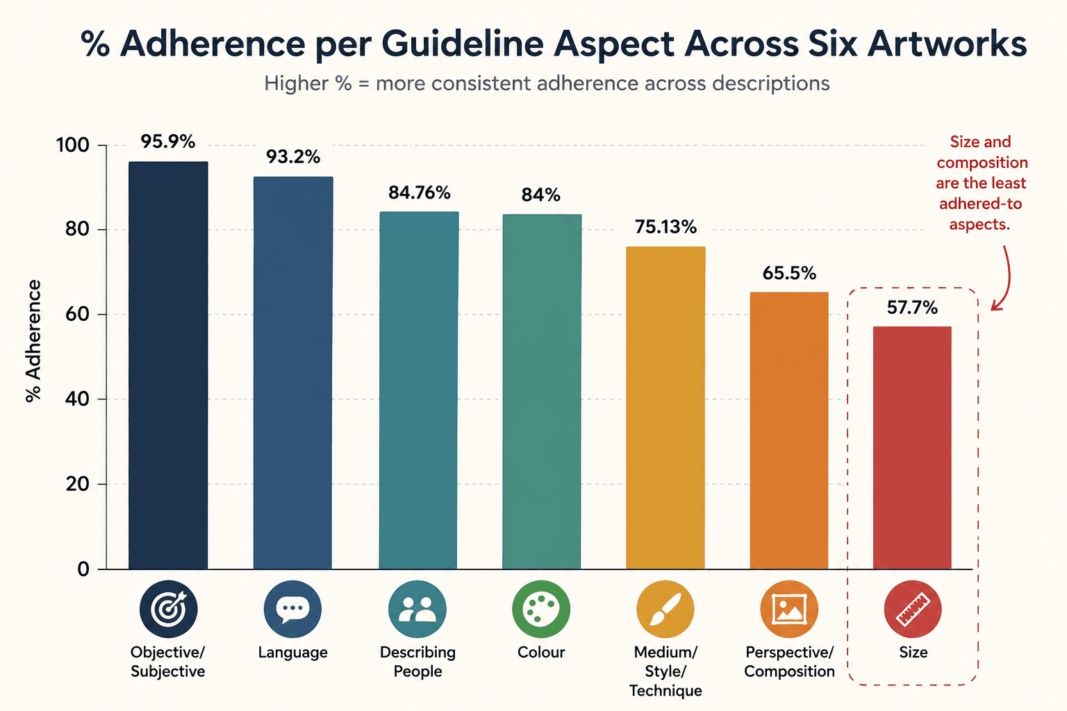
The results were genuinely encouraging on output quality. Descriptions averaged 111 words, and adherence to the guidelines was strong: 95.9% of descriptions included objective/subjective balance, and 93.2% used clear, appropriate language. Confidence was reasonably high as 60% of participants felt confident using the guidelines.
But there was a real gap between what people produced and how they felt doing it. About 35% found the task difficult, and colour was the single most cited pain point:
"It was difficult not to use visual terms and to know how to describe colours." P23
"Trying to see this from a visually impaired point of view and not assuming people would know all about colours." P20
The deeper issue wasn't colour specifically, it was empathetic distance. Several participants struggled less with technique and more with imagining an audience they'd never had to write for before:
"It's quite hard describing things so another person can imagine what you are seeing." P9
Guidelines that work in theory can still be too much to hold in your head
A recurring, very practical complaint: the guidelines themselves were too long to hold in working memory while writing.
"I enjoyed this task but had to remember all the things to include. Perhaps in addition to the guidelines there could be a short summary in bullet point form that's easy to glance at?" P21
This was the moment the project's core tension became concrete: detailed guidelines produce better descriptions, but they're also harder to hold onto while actually writing. That tradeoff became the thing Study 3 had to help resolve.
Study 3
What I found: What blind and partially sighted readers actually valued
This was the study that mattered most, because it closed the loop: the same blind and partially sighted participants from Study 1 came back to rate real descriptions written by real non-experts from Study 2. The guidelines were now of three lengths (short, medium, long) per painting, three paintings.
I used a Related-Samples Friedman's Two-Way Analysis of Variance to test whether length preference differed significantly within each painting, then Wilcoxon signed-rank tests to pin down exactly which pair of descriptions differed.
The statistical pattern was more interesting than "longer is better":
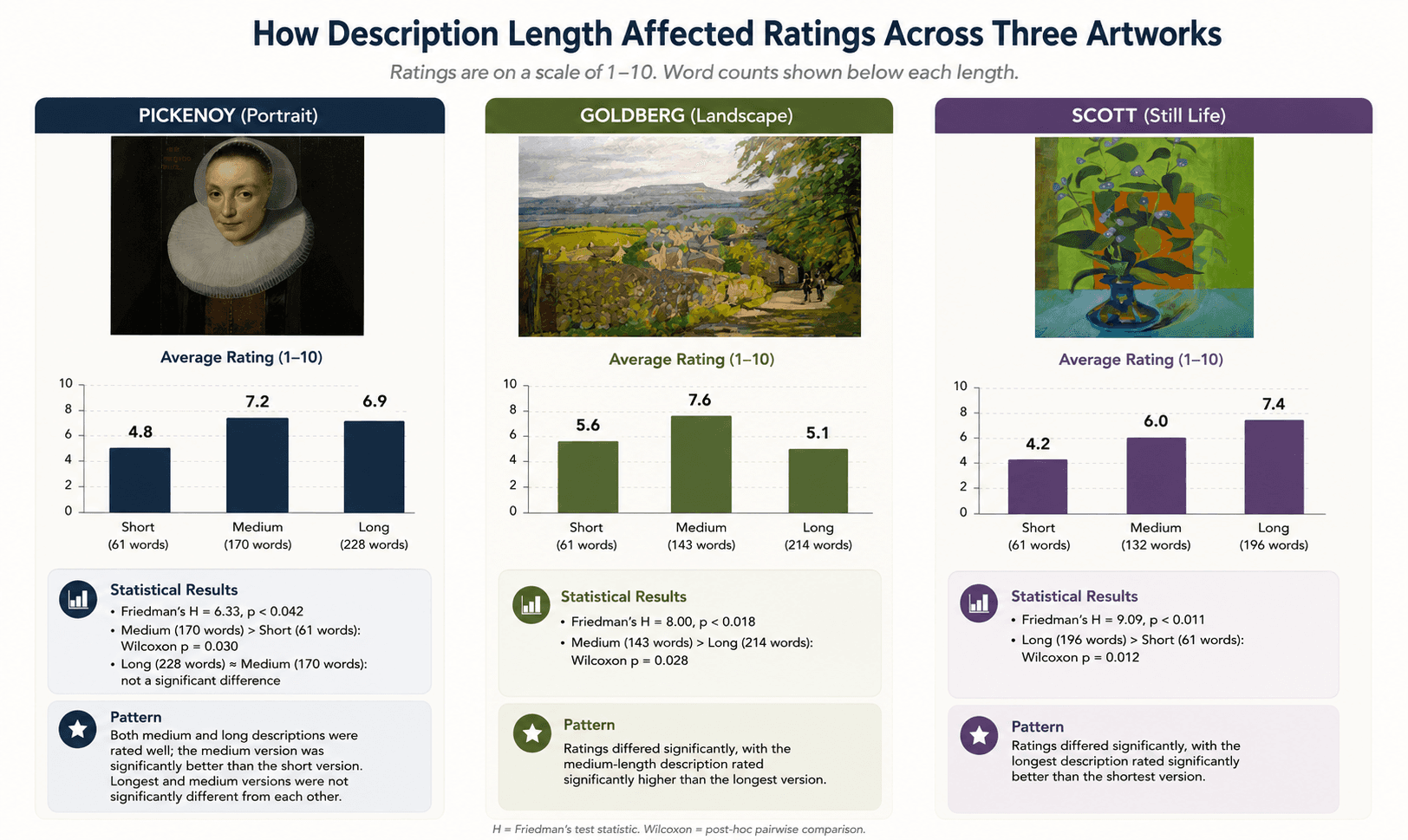
Longer wasn't always better but detailed always was
In other words: the right length depends on the artwork, not on a fixed rule. The effect was statistically real, but it pointed in a different direction for each painting. What stayed constant across every preferred description was specific, well-organised detail, not word count for its own sake.
Participants were remarkably precise about what made a description work. Perspective came up unprompted, again and again:
"The exciting part of the description is again perspective. It's impossible for me to understand how this can be conveyed in a picture, but here, it was described perfectly." VI1
"I got a feeling for where we were viewing from and an appreciation of where we were in the room." VI2
Shade and colour detail, when specific, was valued rather than skipped past which directly contradicted the assumption (visible in Study 2's participant comments) that colour description might not matter to this audience:
"Having info on the perspective is very helpful. Also giving measurements makes it clearer and easier to understand. Having shade information is also good e.g. light blue table." VI3
And the objective/subjective balance turned out to be exactly what blind and partially sighted readers were listening for:
"I liked the topographical positioning of objects. This, for me, is quite important. The person describing this picture was objective, which again, I liked." VI1
Even word choice within a single sentence registered:
"The description of the clothing. Also, terminology. In the first description, she is described as smiling. In this one, it's a grin." VI1
Reflection
So what this means for museums?
Optimise guidelines for scannability. Study 2 showed people didn't fail because the content was wrong, they failed to hold onto it mid-task. A one-page reference card alongside the full guidelines would likely close much of that 35%-difficulty gap without cutting a single guideline.
Let a non-sighted intuition decide what to keep. The clearest miss in this project was size comparisons. A guideline that read as helpful to sighted reviewers and split blind participants right down the middle. Any guideline aimed at a specific audience needs that audience in the room before it ships, not after.
Treat "objective vs. subjective" as a feature. It was the most confusing guideline to sighted describers and the most valued trait to blind and partially sighted readers. That gap is worth designing around directly, to give describers permission and structure for including their own reaction, rather than hedging it as optional.
Flexible description length. What "worked" varied by painting, not by a general preference for long or short. A flexible length, guided by the artwork's own complexity, will likely outperform a house style that mandates one word count for every piece.
Non-experts weren't the risk. Untested assumptions were.
Going in, the implicit worry behind this whole project was that the accessible description was something you needed art expertise to do well. That wasn't what the data showed. Non-experts, working from well-tested guidelines, produced descriptions that blind and partially sighted participants rated as genuinely useful, and prior experience with visually impaired people had no measurable effect on description quality.
What actually put descriptions at risk wasn't the describer's expertise. It was guidelines shaped by sighted intuition about what blind and partially sighted people would want. The intuitions on aspects like size and colour, turned out to be wrong or at best incomplete until tested directly against the people who'd be listening.
That reframes the design question for museums thinking about scale. It's not "how do we find and train enough expert describers." It's "how do we build a system good enough that anyone who cares can contribute meaningfully". The only way to know if a system is good enough is to close the loop back to the people it's actually for, the way Study 3 did here.

The guidelines that came out of this project were delivered as a recommendation for a museum description program. There's a lot more behind the numbers than a scroll can hold. If you want the deeper cut, I'm one email away.
ux.megha@gmail.com