UX Research · End-to-end UX
Making York Volunteering Discoverable
• The City of York Council needed a way for residents to discover, commit to, and track volunteer opportunities, previously scattered across social media, newsletters, and word of mouth. • Ran a mixed-methods study (80-person survey + 15 in-person interviews) to find that the real barrier wasn't a lack of opportunities, it was a lack of trust as people couldn't tell a legitimate role from a questionable one, or gauge the real commitment before saying yes. • Designed and prototyped YorVolunteer, a mobile app addressing this through verified-organizer badges, upfront role details, in-app chat gated behind that trust layer, and an activity/rewards system for tracking past volunteering. • Validated through two rounds of evaluation (Collaborative Heuristic Evaluation + Task-Based User Testing), which surfaced and fixed issues by severity before handing off a fully interactive prototype and design-rationale report to developers.

Starting Point
Why can't York's most willing volunteers find a way in?
The City of York Council came to us with a clear brief: residents wanted to volunteer, but there was no centralized way to discover opportunities, commit to them, or keep a record of what they'd done. On paper, that's a straightforward information architecture problem. In practice, it's a trust and discovery problem and those are much harder to design for.
"Before signing up, I want to know what's expected of me, who I'll be working with, and whether I'll actually be useful. Most opportunities don't tell me enough to feel confident committing." P6
The Gap
Volunteer coordination in York was scattered across social media groups, university newsletters, and word of mouth. Each of those channels works for exactly the person already embedded in that network and fails everyone else. I wanted to know: what's actually stopping people who want to volunteer from doing it, and what would it take to remove that friction?
How might we help York residents discover, commit to, and track volunteer opportunities that actually fit their lives?
The Question → The Method → Why
I needed real reasons, not just usage patterns
A survey alone would have told me what people were doing such as browsing for opportunities on social media, missing out on roles, giving up. It wouldn't have told me why the process broke down for them, or what they needed instead. So I paired both: a broad quantitative survey to find the shape of the problem, followed by in-person interviews to understand the reasoning underneath it.
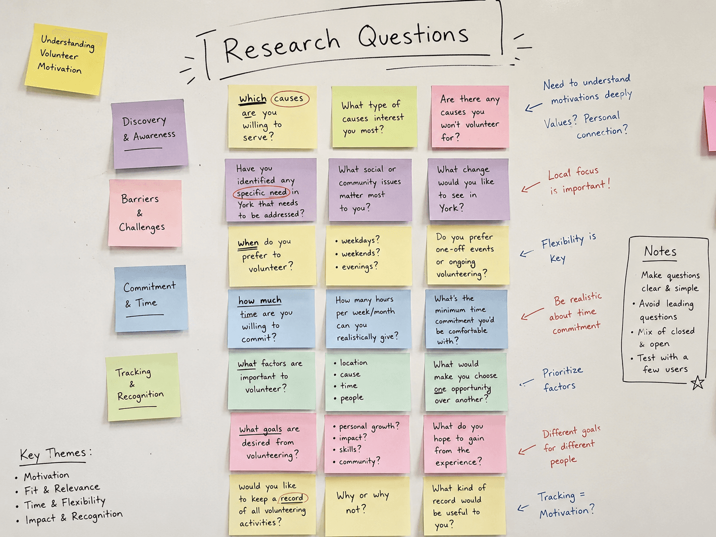
We surveyed 80 people and kept 64 valid responses, weighted toward the 18–24 age group. Alongside that, I conducted 15 in-person interviews with a mix of graduate/ postgraduate students and faculty, under full ethical consent, to dig into motivations and blockers that a survey can't surface.
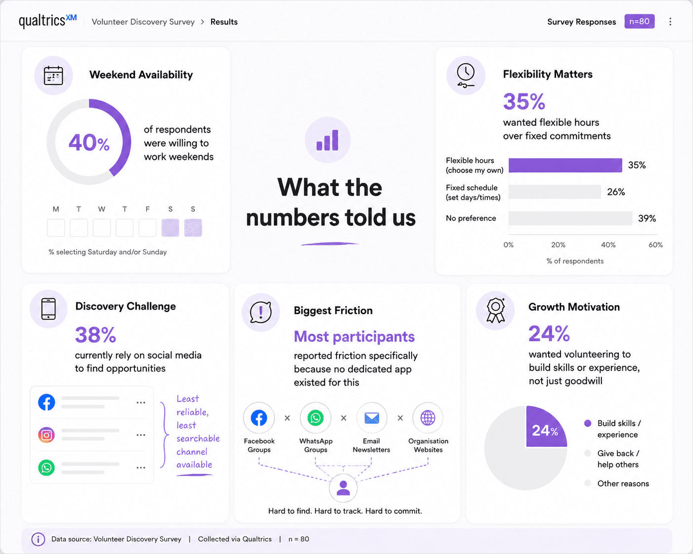
"I want to help, but opportunities are scattered everywhere. By the time I find something that fits my schedule and interests, it's either full or I've forgotten about it." P4
That last finding mattered most. It wasn't that people didn't want to volunteer, and it wasn't that opportunities didn't exist. It was that the infrastructure to connect the two didn't.
How I made sense of it
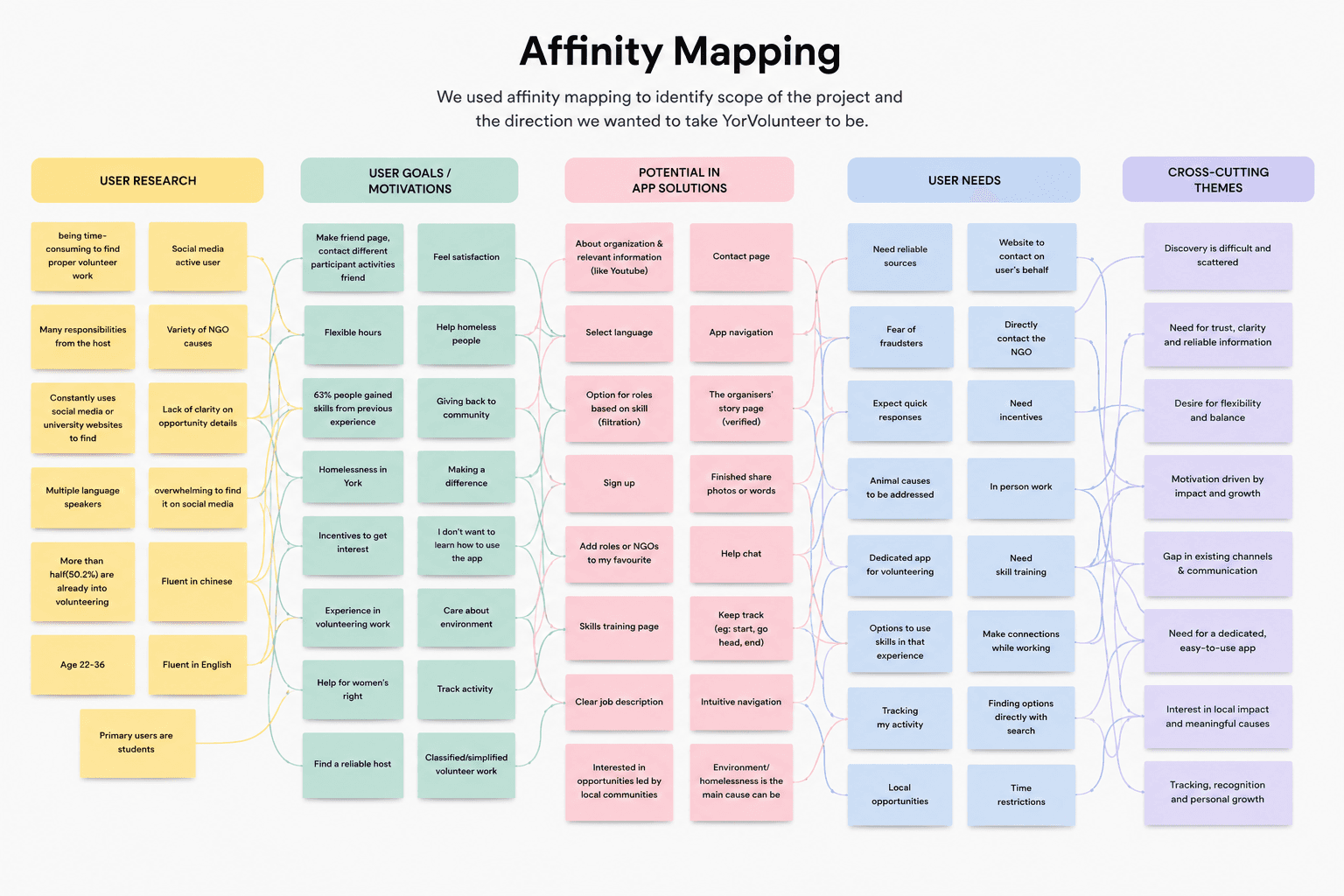
I ran the qualitative data through affinity mapping, organizing it into four clusters: User Research (who these people were and how they behaved), User Goals & Motivations (what they wanted out of volunteering), User Needs (what was missing from their current process), and Potential App Solutions (early feature ideas grounded directly in the first three).
That structure did real work. I could trace every feature back to the specific need that caused it. Such as reliable sources became verified organizer badges, fear of fraudsters became an in-app chat instead of off-platform contact, and the desire to track past activity became the certificate and rewards system.
Proof of Process
Two people, two very different starting points
Rather than design for an average user who doesn't exist, we built around two real, conflicting sets of needs.
Alex: a local postgraduate student, socially confident, already somewhat experienced with volunteering. She's not short on desire to help; she's short on a reliable way to find roles that match her time and interest, and she's wary of hosts who over-promise responsibility she didn't sign up for.
Xian: an foreign exchange student with no prior volunteering experience, looking to fill his term breaks and strengthen his resume. He doesn't know where to start, hesitates to reach out to organizations directly, and has never used an app like this before so onboarding had to work for someone starting from zero.
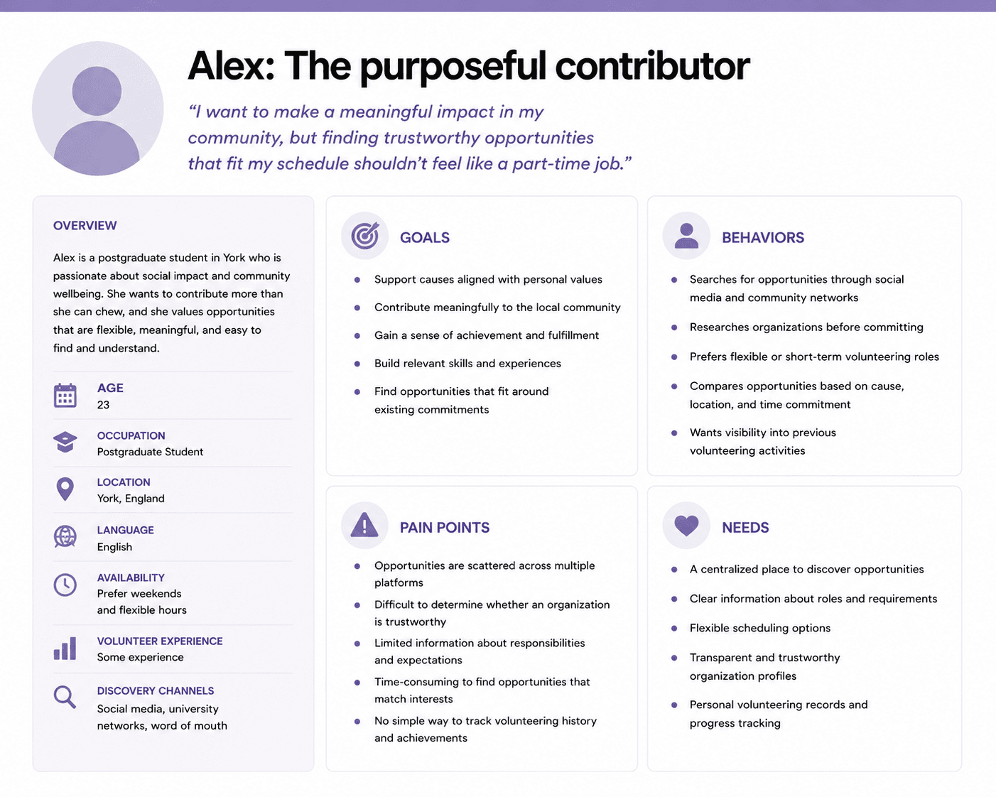
Designing for both meant the app couldn't just be a search tool for the confident volunteer. It had to actively lower the barrier for someone who'd never done this before.
What made these two personas useful wasn't just their differences. It was that their frustrations pointed at the same root cause from opposite directions.
Alex had volunteered before, so she knew what a bad experience looked like: vague role descriptions, slow email back-and-forth, and organizers who understated how much they were actually asking for. Her caution wasn't inexperience, it was pattern recognition. She needed to see the real scope of a commitment before she said yes, not after.
Xian had never volunteered at all, and that came with a quieter, harder problem: he didn't know what "normal" looked like, so he had no way to tell a legitimate opportunity from a questionable one. Where Alex's fear was being misled by an organizer she could otherwise evaluate, Xian's fear was not knowing how to evaluate anyone in the first place. Reaching out directly felt like a risk he wasn't equipped to take.
Read together, the two personas weren't describing two different products. They were describing one missing layer: clear, upfront information that lets a stranger be trusted before any conversation happens. That single insight is what shaped the event details screen, the verified-organizer treatment, and the decision to put in-app chat behind that trust layer rather than in front of it.
Scenario Design
From Frustration to Flow
To pressure-test the experience before building anything, I wrote out Alex's journey twice: once through the broken status quo, once through what YorVolunteer (our concept app) could offer.
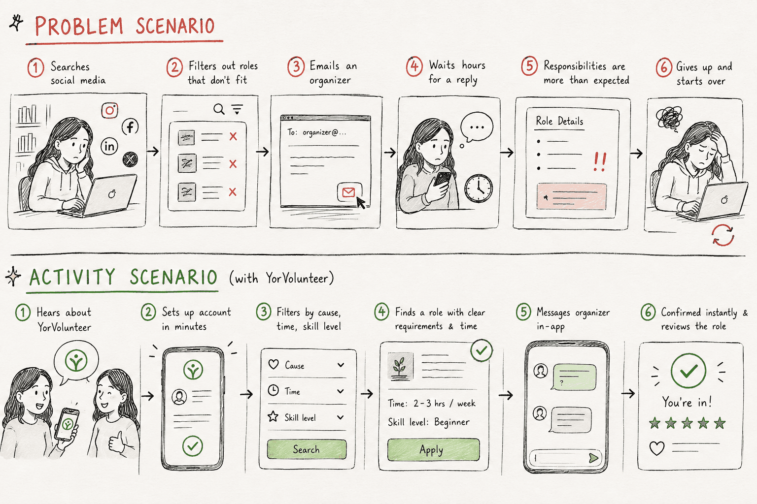
The gap between those two scenarios is the product brief. Every core feature such as filters, in-app chat, instant confirmation, activity history exists because a specific step in the problem scenario broke down.
Prototype
Getting to something testable, fast
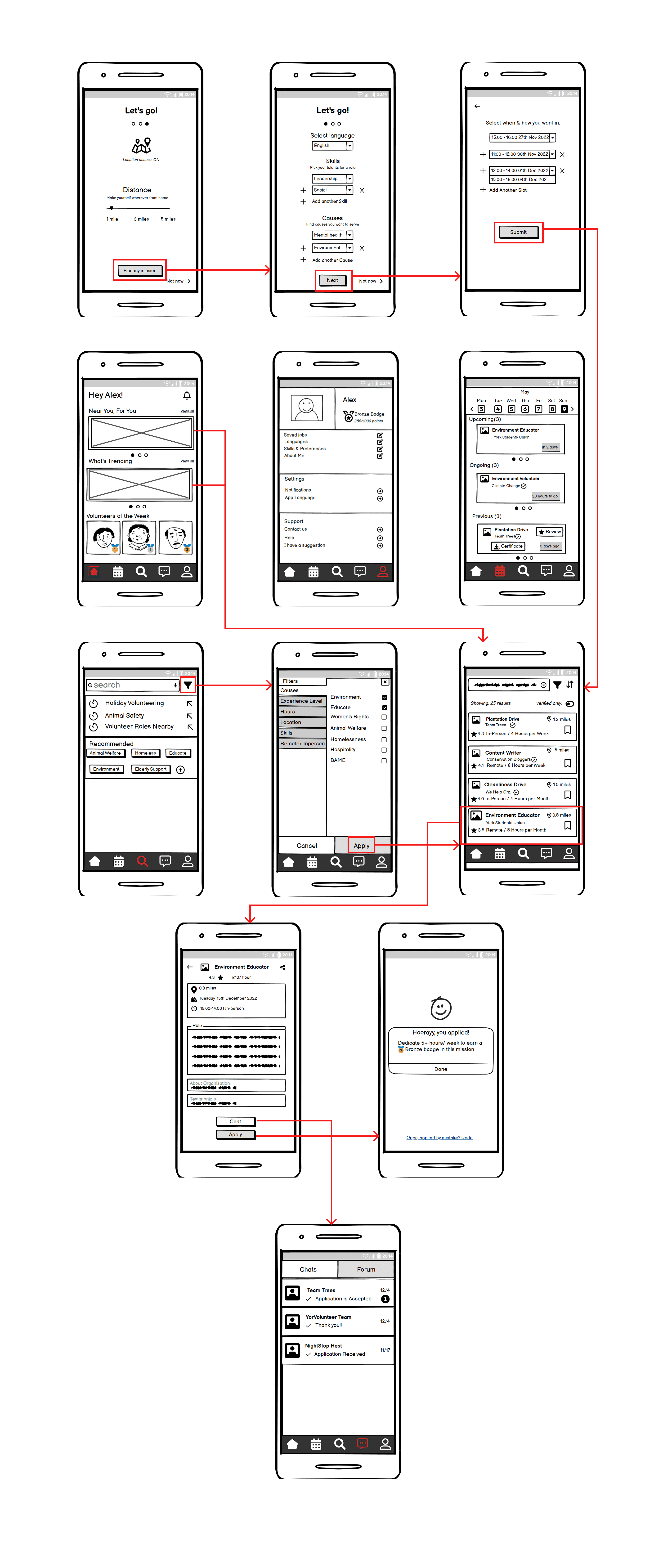
We sketched and wireframed low-fidelity screens across the core loop: onboarding (sign up, select language and availability), choose the location, home discovery, search and filtering, event details, and a profile/activity hub for tracking commitments and rewards.
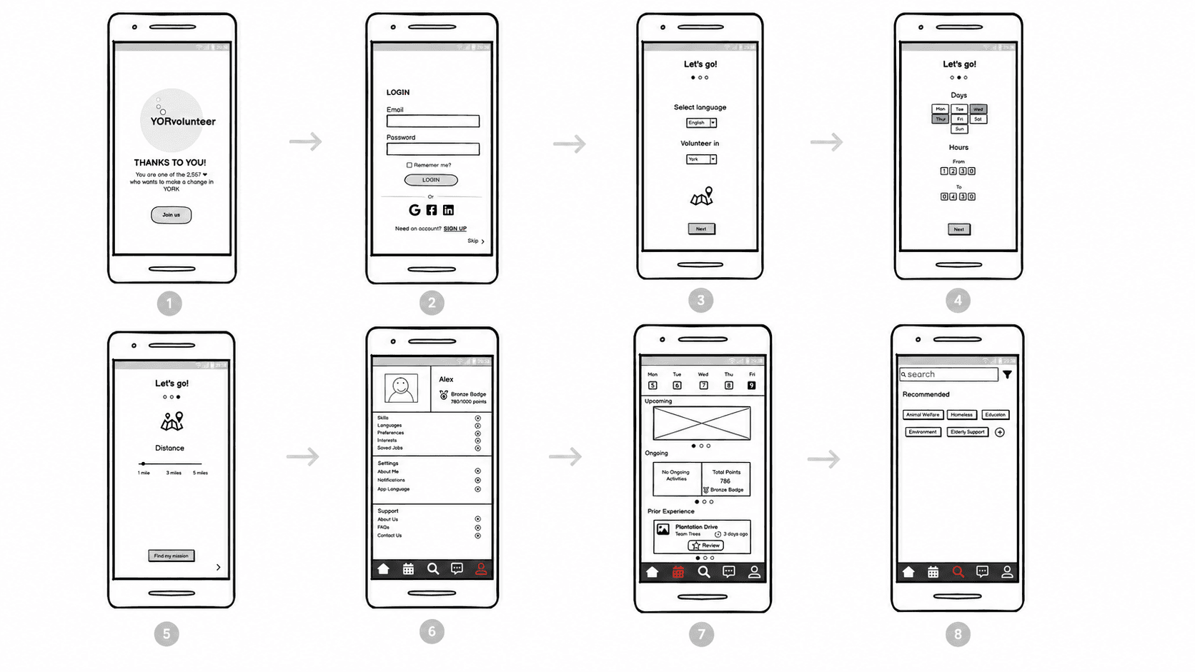
This wasn't meant to be polished. It was meant to be fast enough to put in front of evaluators and users before we'd invested in anything that would be painful to throw away.
Test & Iterate
2 Rounds of evaluation and Re-designing the Concept
Round 1: Finding out where the design lied to itself
Before testing with real users, I ran a Collaborative Heuristic Evaluation against Nielsen's heuristics. We worked through the prototype independently, then reconciling findings together. This caught structural issues early: unclear navigation logic, inconsistent filtering behavior, and screens that assumed knowledge a first-time user like Xian wouldn't have.
Round 2: Watching people actually try to use it
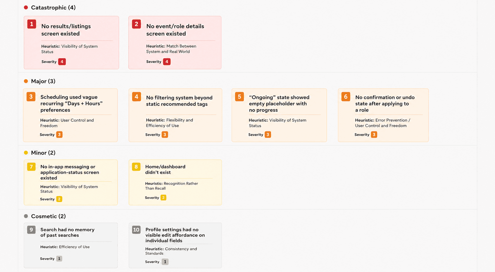
CHE told us where the design was internally inconsistent. It didn't tell us where real users would actually get stuck. For that, I ran Task-Based User Evaluation using Concurrent Verbal Protocol where participants narrated their thinking out loud while completing defined tasks: sign up, search and apply for a role across single and multiple time slots, use the in-app chat, log a past volunteering activity, download a completion certificate, and check their reward points.
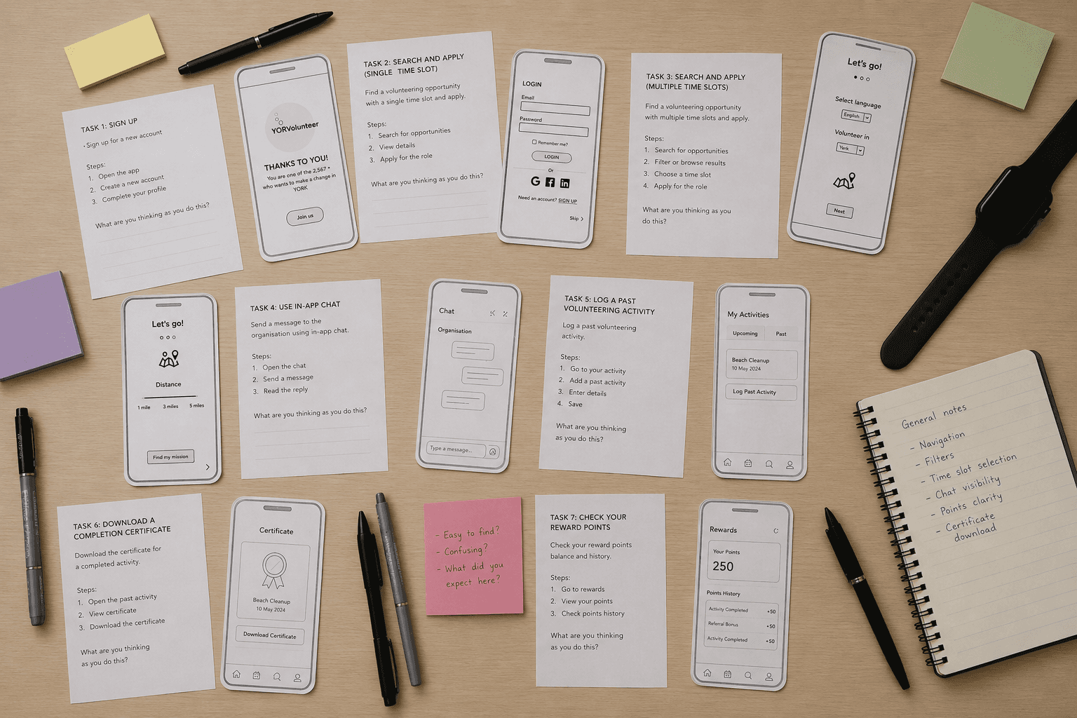
Every issue I found was rated on a 4-point severity scale, from cosmetic to usability catastrophe, which let us prioritize fixes by actual impact rather than by whichever issue was loudest in the room.
The redesign
The two evaluation rounds surfaced a consistent pattern: users could find things, but couldn't always trust or complete the loop around them. The redesign addressed that directly:
Onboarding got shorter and more purposeful. Language, skills, and causes were consolidated so a first-time user isn't front-loaded with decisions before they see any value.
Filtering and search were unified into one clear flow, instead of separate, inconsistent entry points. Directly answering the CHE finding that navigation logic wasn't holding together.
The event details screen now carries everything a user needs to trust a role before committing such as organizer info, time commitment, distance, and a direct chat option, answering the fear-of-fraudsters and unclear-responsibility issues that showed up all the way back in the affinity map.
A visible activity and rewards loop (certificates, badges, points) gives users the tracking and sense of progress the original research showed they wanted but couldn't get anywhere else.
So What? - What shipped to developers
The final deliverable wasn't just screens. I handed developers a fully interactive prototype covering the complete user flow, alongside a report walking through the iterative design process as the reasoning behind each decision, not just the decision itself.
What this project actually taught me
That reframed the whole project. It stopped being "how do we help people find volunteer roles" and became "how do we make committing to a stranger's cause feel safe enough to actually do."
The clearest throughline across the research, the two evaluation rounds, and the redesign was the same thing showing up in different forms: people didn't need more opportunities. They needed a system they could trust enough to commit to one.
There's a lot more behind this than a scroll can hold. If you want the deeper cut, I'm one email away.
ux.megha@gmail.com